USC
Transforming USC's fragmented web presence into a sustainability ecosystem for 50,000 users.

- Rebuilt USC's sustainability digital presence, achieving 430% traffic growth from launch to peak with 300K+ page views and 100K+ unique visitors
- Drove 77% quarterly traffic surges and 426% daily user growth while maintaining 33% return rate
- Launched institutional initiatives including the Presidential Sustainability Solutions Fellowship and annual reporting framework tracking 30+ sustainability metrics
The University of Southern California is a leader in education, athletics, and — more recently — sustainability. They’ve woven their commitment to an eco-friendly campus into things like LEED-certified buildings, innovative research, and community outreach. As USC's sustainability efforts gained traction, they embraced experimentation and iteration — however, this growth led to a digital presence that was fragmented and confusing.
Multiple schools had sustainability web pages, and two dedicated sustainability websites, green.usc.edu and sustainability.usc.edu, were serving nearly identical functions. Meanwhile, the USC Communications team was planning a sustainability section debut on the main USC website to showcase progress and achievements. This growth was admirable, but not built with users in mind.
I was brought in to clarify these digital spaces, optimizing them for everyone from dedicated researchers to curious visitors. The first priority? Diving deep into the technical infrastructure, user behavior, and organizational needs that had shaped this digital landscape.
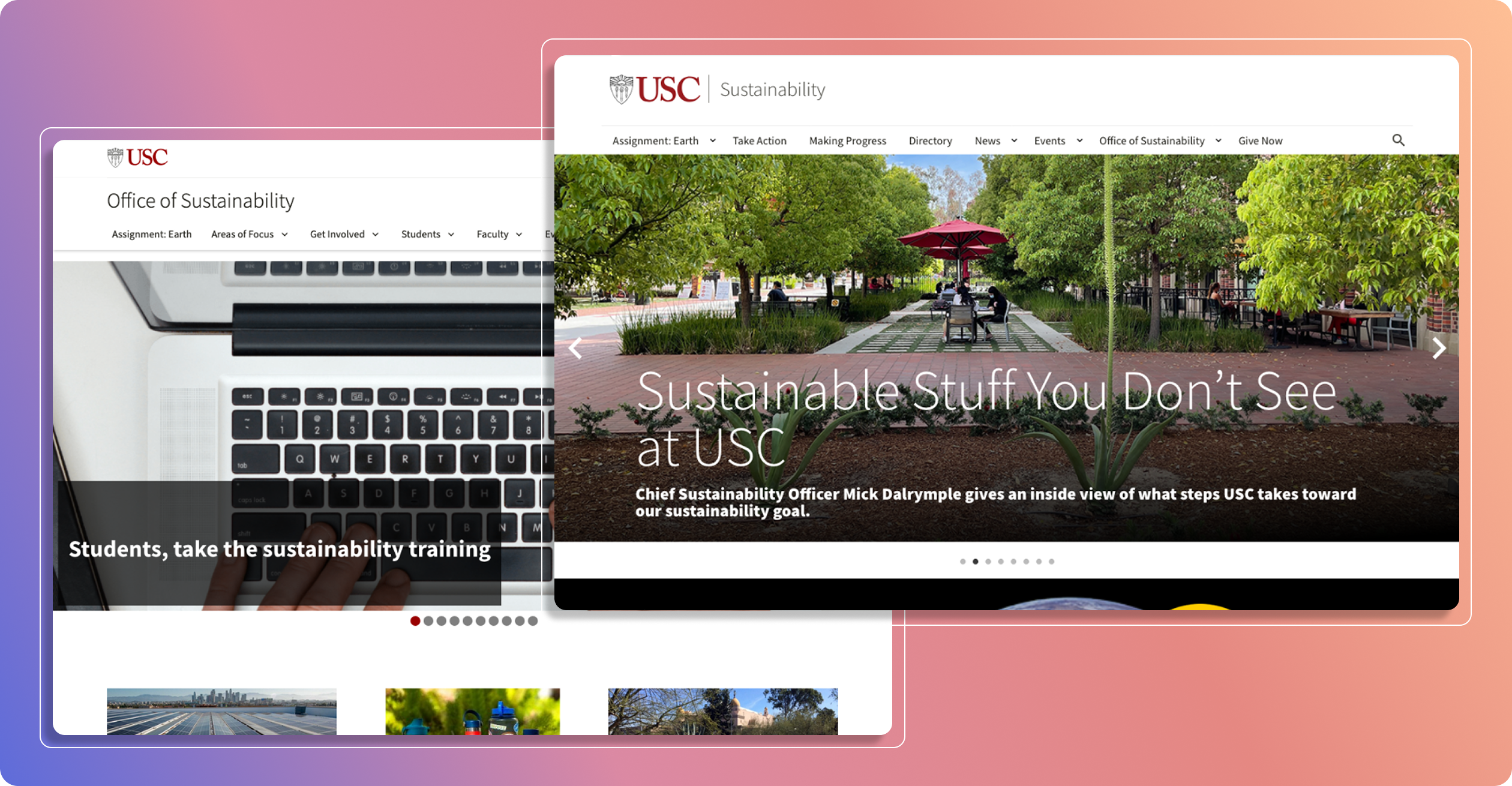
When first approaching this project, the obvious solution seemed to be consolidation — merge everything into a single, comprehensive sustainability website. However, due to technical and organizational constraints, neither site could be fully deprecated and the to-be-launched high-level page on the main USC site would also remain.
While this initially appeared to be a limitation, it became an opportunity to think differently about content organization against rigid guidelines. So, instead of fighting this limitation, I turned it into an advantage. I analyzed user patterns, interviewed stakeholders, and mapped existing content to create a clear division:
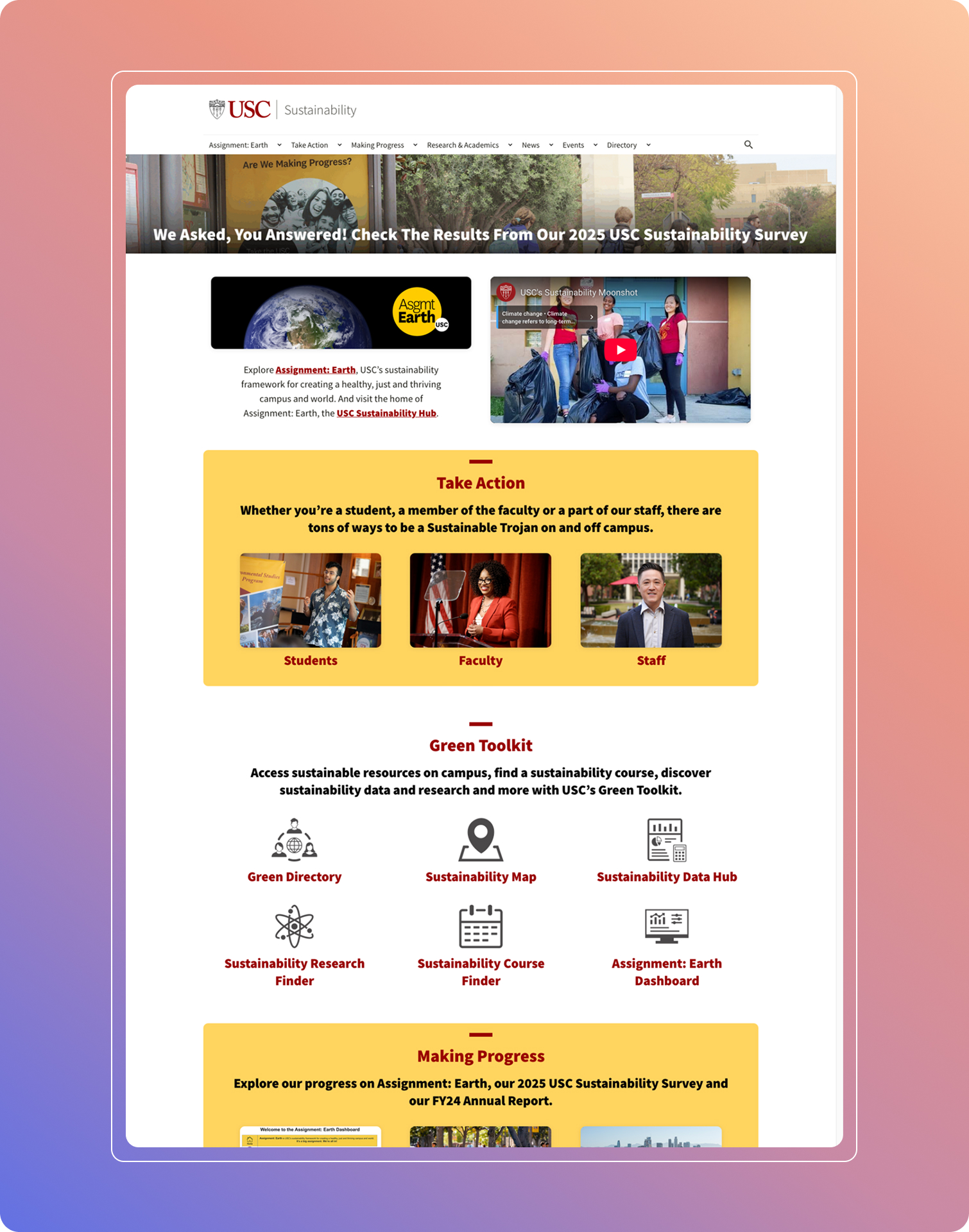
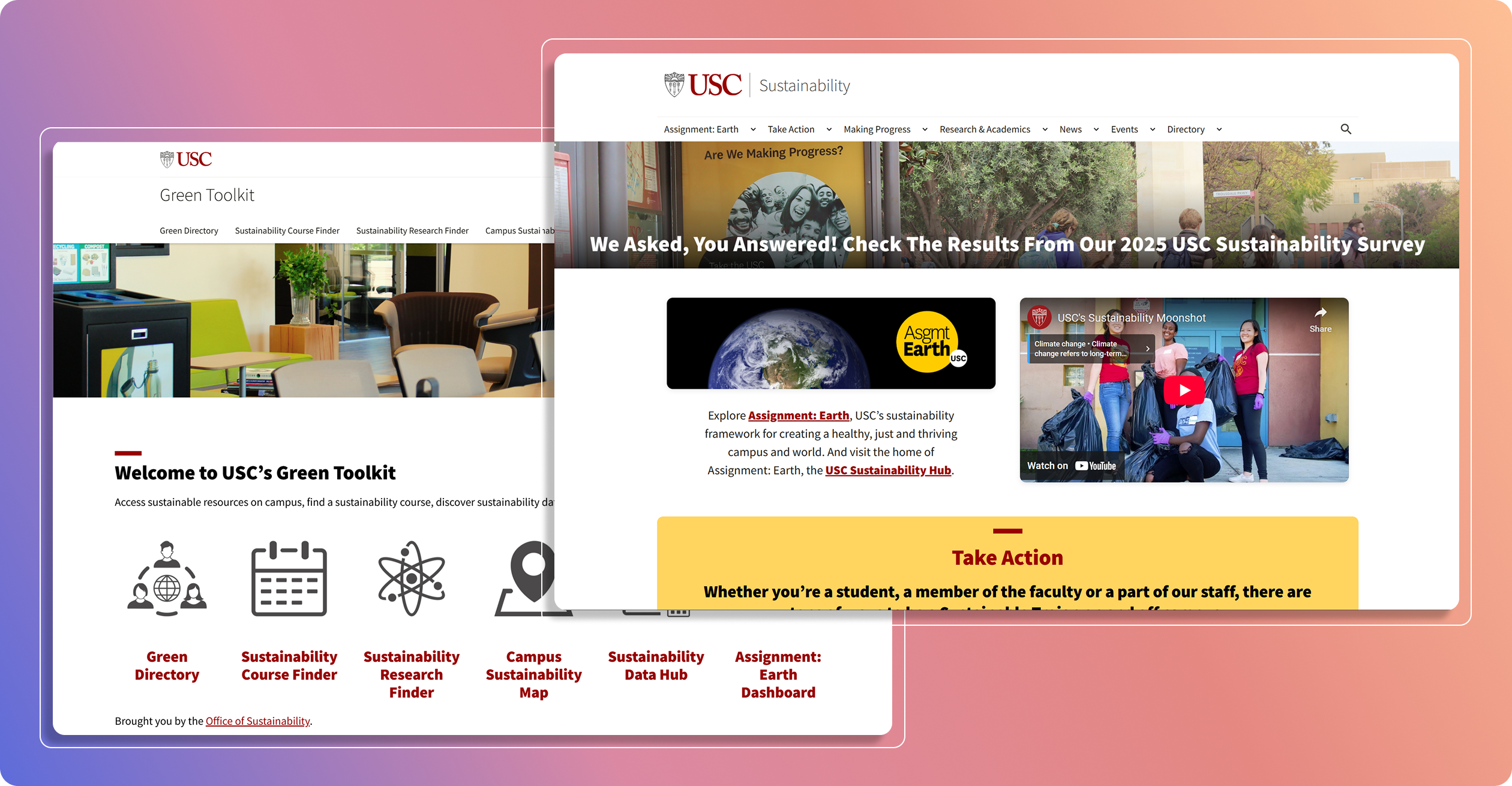
Primary Site (sustainability.usc.edu):
- Gateway for core sustainability practices
- Current news and updates
- Direct action steps tied to USC's Assignment: Earth plan
Secondary Site (green.usc.edu):
- Home for sustainability-adjacent content
- University-Wide Green Directory
- Sustainability Course Finder, Research Finder, and Data Hub

This approach created natural pathways serving both casual visitors looking for basic information and power users needing in-depth resources.
Since the restructuring, USC has seen impressive improvements:
- 430% traffic growth from launch to peak with 300K+ page views and 100K+ unique visitors
- 77% quarterly traffic surges and 426% daily user growth while maintaining 33% return rate
- WordPress templates and code adopted across USC departments
- Simplified content management and promotion workflows for the sustainability organization
- Smooth integration with high-level main site content
Intentional revision within rigid guidelines can help you build something great that you never would otherwise. By embracing constraints rather than fighting them, I created an intuitive experience that serves all users better while establishing a model for USC's digital future.
P.S.
If you've made it this far, check out this adorable falling objects minigame I made for Earth Month 2025.

.png)